This topic is ONLY relevant to security gateways. It is NOT relevant to managed switches.
Overview

Figure 1. Example Mako Device Usage Page
The Mako Device Usage page (Fig. 1) allows you to view and generate usage data reports for the selected Mako device.
Reports
Chart
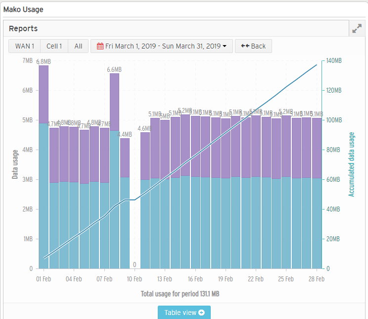
Figure 2. Example Report Chart
The Report Chart (Fig. 2) illustrates data usage for the selected networks over the specified date range.
Filter Buttons
Use the filter buttons at the top of the chart to control what data appears in the report.
You can view an individual WAN or Cell’s usage by clicking its named button, or you can view all usage by clicking the “All” button.
The calendar button is where you can specify the date or date range to view. Choose from the following options:
- Today
- Yesterday
- This Week
- Last Week
- This Month
- Last Month
- Current Billing Cycle
- Last Billing Cycle
- Custom Range
Choosing the “Custom Range” option will allow you to enter custom start date and end date values to define the date range.
To go back to the previous date range selection, click the “Back” button.
Bar Graph
The bar graph in the chart shows data usage over the specified date range broken into regular time periods. It uses a date range x-axis at the bottom of the chart and a data usage y-axis at the left side of the chart.
The time period represented by a single bar is determined by the date range currently being viewed. When viewing a single day the time period is one hour, but for all other date ranges the time period is one day.
The blue lower portion of each bar represents the amount of data downloaded during the time period. The purple upper portion of each bar represents the amount of data uploaded during the time period.
Hover over a bar to see additional details for that bar:
- Total Data Usage – total amount of data usage for the current time period
- Uploaded – amount of data uploaded for the current time period
- Downloaded – amount of data downloaded for the current time period
- Accumulated Data Usage – accumulated total data usage from the chart’s start time up to and including the current time period
Line Graph
The line graph in the chart shows accumulated data usage over the specified date range. It shares the date range x-axis with the bar graph, but uses a separate data usage y-axis at the right side of the chart.
Table
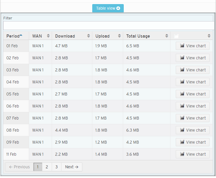
Figure 3. Example Report Table
Click the “Table View” button to view the Report Table (Fig. 3). The Report Table displays the data from the chart in a tabular format.
Filter Field
Enter search terms here to filter the data rows shown in the table based on matches in the WAN, Download, Upload, and Total Usage columns.
Columns
- Period – time period
- WAN – network
- Download – amount of data downloaded
- Upload – amount of data uploaded
- Total Usage – total amount of data usage
- View Chart – view chart button
You can use the column heading links to sort the data shown in the table by a column’s values. Click the column heading once to sort in ascending order or twice to sort in descending order.
View Chart Buttons
To change from the current report to a report for a single time period in the current data table, click its “View Chart” button in the View Chart column. This will update both the chart and the table to use the range of the old time period as the full date range for the new report.
Full Screen Button
To expand the report to the full screen dimensions so that it is easier to view, click the outward-facing arrows icon button at the top right of the report.